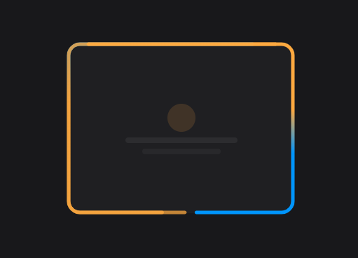
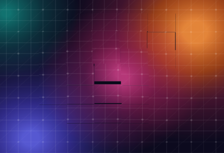
Animations
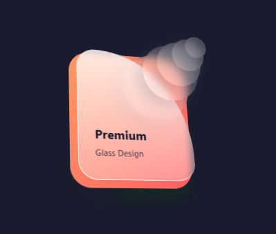
Visual Effects
Eye-catching visual elements and decorative effects
18 animations


Pro Lifetime
Need more effects?
Combine animations with wireframes to build complete, stunning sections in Bricks Builder.
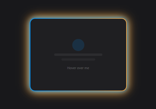
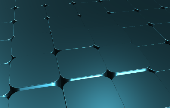
Animations
Eye-catching visual elements and decorative effects
18 animations
Pro Lifetime
Need more effects?
Combine animations with wireframes to build complete, stunning sections in Bricks Builder.